
Document accessibility
Creating accessible tables in documents
Tables are one of the best ways to organise data in documents. They are easy to make and easy to read, even if the table’s content is complex – at least for sighted users.
However, ensuring that tables are accessible for people with disabilities, is a completely different task altogether. It requires a wide range of attributes that are not visible or obvious to the sighted user. Learning this skill is imperative if you want to make your tables accessible.
The following guide will take you through the ins and outs of creating accessible tables in documents.
Introduction to tables
Before learning what makes a table accessible, it is necessary to understand the basics of data tables. Tables are used to present data in a grid or matrix (which is known as table structure or table layout). Tables consist of:
- Cells (also referred to as data cells) are the individual fields and contain your values.
- Rows are horizontal lines of cells.
- Columns are vertical lines of cells.
This is the basis of any table and if used correctly, it is an effective way to present information.
What makes a table accessible?
Proper markup makes it easy for a sighted user to scan the tables and make visual associations between the rows and columns if there is a logical relationship between the cells. However, people with disabilities, such as blind users, or users with vision impairments, are unable to make visual associations.
People with disabilities use screen readers (assistive technology) to access web pages and documents. Screen readers read tables one row at a time, which makes it difficult to interpret the data, unless the table headers, rows and columns are implemented correctly.
So where do you begin?
Always include table headers
All tables must have both row and column headers. Your row header should be the top row of your table. Your column header should be the first column from the left. These “header cells” should always state what kind of information is contained in the columns and rows.
Tagging row and column headers correctly provides a context for the table’s content and is a success criteria if users with disabilities are to navigate the table.
Avoid complex tables and merged cells
Limiting the complexity of your tables can be very difficult, but if you want to create an accessible data table there are a few things you must keep in mind.
Avoid tables within tables
Tables within tables should always be avoided. Split them in two separate tables or try to find another way to present your data if necessary.
Avoid merged or split cells
You should also avoid merged or split cells. Data tables containing merged or split cells will be very difficult, in some cases impossible, to access in a way that makes sense for the disabled or blind users.
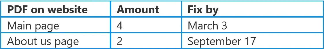
Example of an inaccessible table
This data table is not accessible. It will be very difficult for screen readers to read aloud in a way that makes sense.
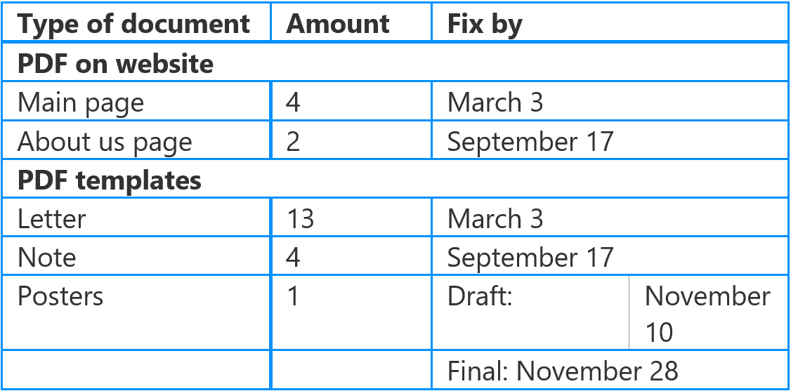
In the table above, the PDF on Website and PDF Templates rows are made of 3 merged cells and the Posters table cells contain a split cell in the column called Fix by.
If a table contains uneven rows and columns it will be difficult for screen readers to read, and you can not be sure that the table cells are read out in the intended order.
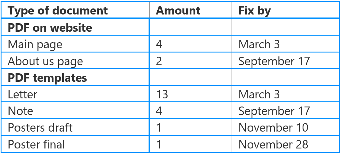
Below is an example of a much more accessible table.
Consider adding alt text
Most tables have brief descriptive text before or after the table that indicates the content of that table. Sometimes it’s a good idea to add a detailed alt text – especially if the table is used for layouts and cotains images. More on this later.
Note: It’s worth knowing that if you are working with HTML or exporting to PDF, the alt text should be added as a element.
While it is not necessary for all tables to have an alt text, alt text is generally very helpful and you should make sure that you know how to write good alt text.
Try to avoid blank cells
Screen readers start at the top left cell and therefore, it should never be left blank, as the user may believe that the rest of the table is also empty. As a general rule, you should try to avoid blank cells anywhere in the table as they could mislead the user into thinking that the table has no more cells.
Can you use blank cells for layout tables?
Layout tables are the one exception to blank cells being a no-go. Some templates and documents use a single cell table to setup an exact placement for objects, images or logos if their design requires it. They don’t need to be tagged as a header, but it’s fine if you do it anyway.
The one thing to remember is that if you add an image, logo, or other graphic object within a layout table, it should be considered an image and you should write good alt text for it.
Don’t use images or screenshots
Always build tables. Screenshots of data are not accessible without an alt text and writing data in alt text is much more difficult for both the author of the document, as well as the screen reader accessing it.
Creating accessible tables in Microsoft Word, Excel, and PowerPoint
Add row headers to a table
- Choose Insert in the ribbon and then go to Table to insert a table.
- Choose the size you want your new table to be.
- Notice that two new tabs appear in the ribbon when you add a table. These new tabs are called Table, Design and Layout.
- Go to the Design tab, on the left you will see the Table Styles Options group.
- Tick or untick Header row to tag up your tables top row as the header.
- Your table now has a header.
Add column headers to a table
- Choose the first table cell on the top left row of your new table.
- You can now type the name for this column and by pressing tab you can move on and add more column headings.
Exporting tables to PDF
If you are going to export your documents to PDF, it is necessary to understand a little HTML if you want to audit for exported document.
In HTML and on a screen reader, table headers are marked up with, it stands for Table Header. Rows are marked up which stands for Table Row. Data cells are marked up as, which stands for Table Data.
You can tell the number of columns in HTML by looking at the amount of for each row. If a has 3 in it, it means there are 3 columns – usually, the first of the will be used as column headers in your table.
Best practice, tips, and tricks
- Always include table headers, column headers, and row headers.
- Avoid merged and split cells. They are easy to read for a sighted user, but a screen reader will have trouble making sense of them.
- Never use screenshots or images of tables. It is easier for everyone to use a real table.
- When you finish tagging a table, make sure to check it in a screen reader tester, like the PAC-tester. As a sighted user, it can be difficult to measure accessibility without a tester.